Nutella Brand Redesign
Giving a classic a modern makeover with a touch of whimsy and sophistication.
Overview
A conceptual redesign of Nutella packaging that bridges nostalgia and sophistication, appealing to both younger and mature audiences.
My role:
Brand, Package Designer
Product Photographer
Tools:
Adobe Illustrator
Adobe Photoshop
Time:
2 weeks
1. The Challenge
Nutella’s packaging is instantly recognizable, but its visual language has remained largely unchanged for decades. While this consistency reinforces brand recognition, it also makes the product feel dated in a market where younger audiences—especially Gen Z—are drawn to expressive, design-forward, and socially shareable brands.
The existing design primarily communicates familiarity and tradition, but lacks the visual flexibility and cultural relevance needed to engage multiple generations at once.
2. The Goal
The goal of this redesign was to modernize Nutella’s visual identity while preserving its emotional warmth—creating a system that feels timeless to older consumers and expressive, playful, and premium to Gen Z.
The goal was not to reinvent Nutella, but to reinterpret it through a contemporary visual lens.
3. Key Design Decisions
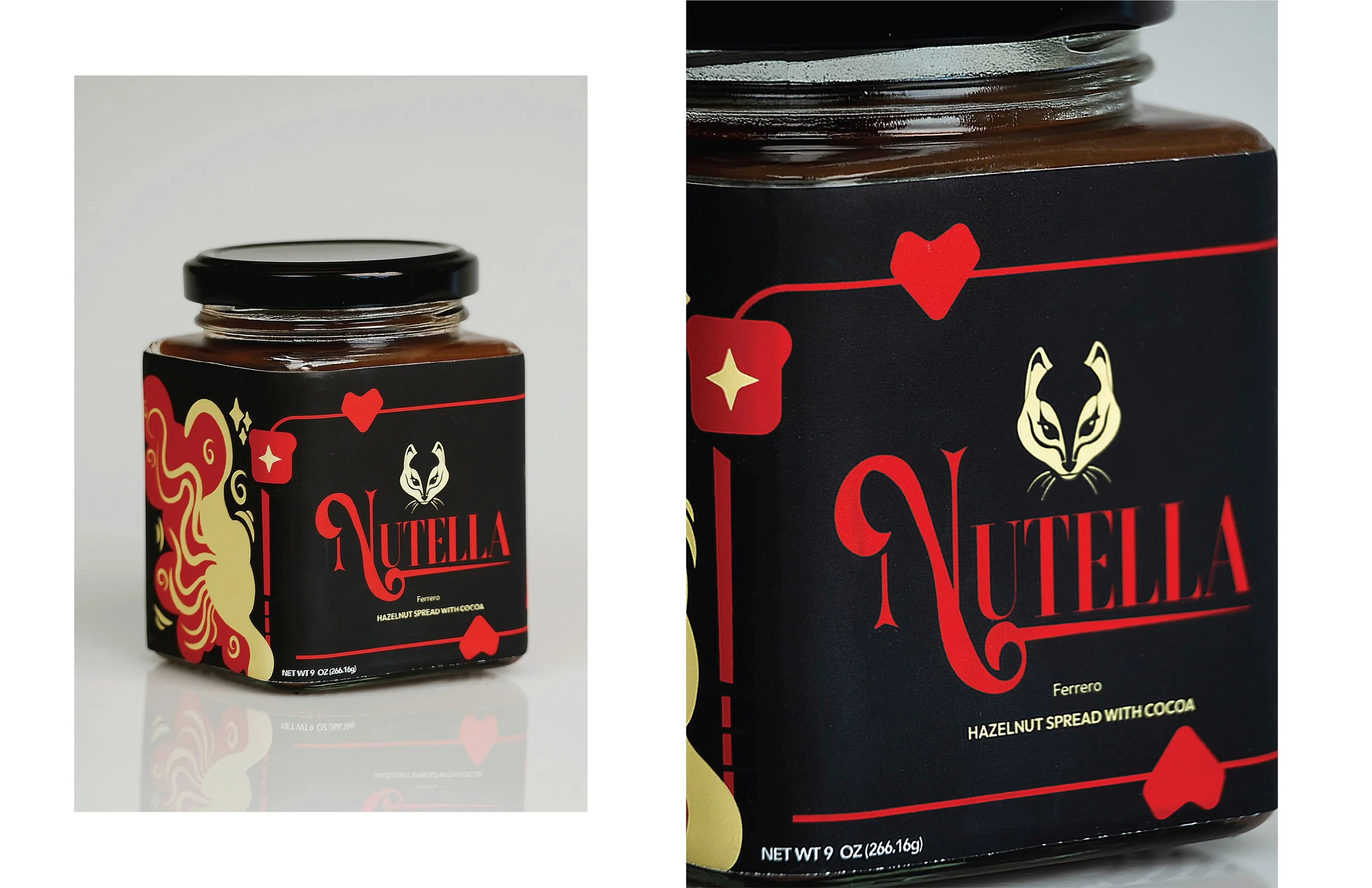
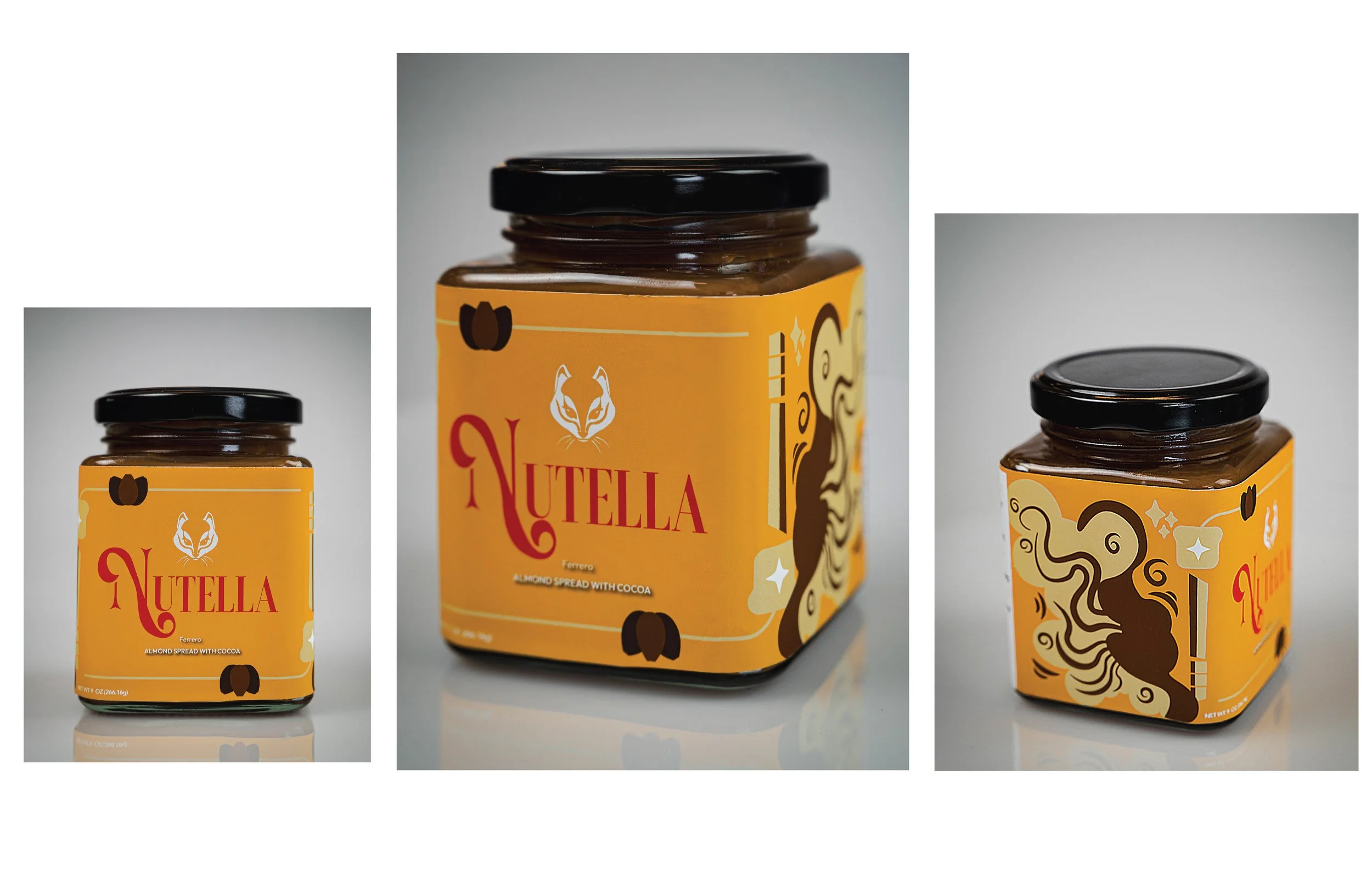
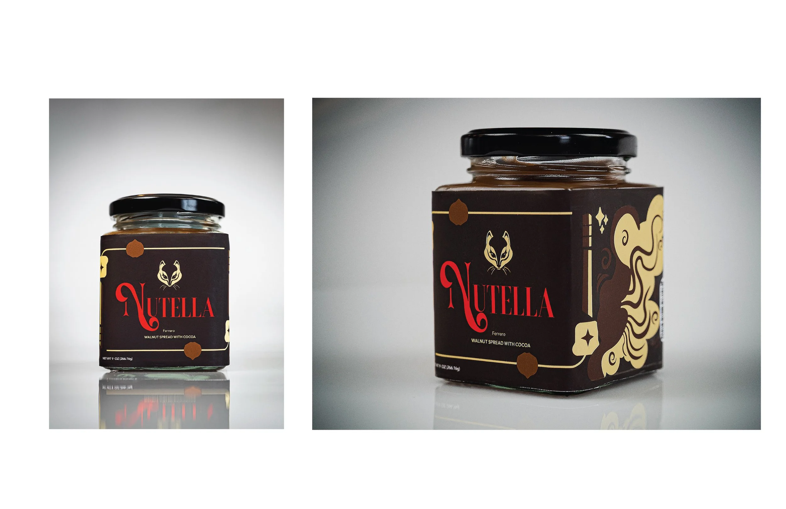
Visual Expression
Bold typography, high-contrast color palettes, and graphic illustration were used to make the packaging feel expressive and collectible—qualities that resonate strongly with Gen Z visual culture.
Social Shareability
The packaging was designed to photograph well from multiple angles, encouraging organic sharing across social platforms without relying on overt marketing cues.
Playful Symbolism
Playing card motifs and heart symbols introduce familiarity through abstraction, allowing the design to feel playful without becoming childish.
4. Why this Matters
As Gen Z becomes a dominant consumer group, brands rooted in nostalgia face the challenge of staying culturally relevant without losing authenticity. This project explores how an iconic brand can evolve visually while remaining emotionally familiar.
5. Final Outcome
I was challenged by this assignment to update an existing brand without diluting its essence. I gained an understanding of how generational perspective may be influenced by seemingly little alterations to typography, color, and symbols. To make sure the final system seemed modern instead of trendy, the designe had to purposefully be playful while also being clear and restrained in order to appeal to Generation Z.
6. Reflection
I was challenged by this assignment to update an existing brand without diluting its essence. I gained an understanding of how generational perspective may be influenced by seemingly little alterations to typography, color, and symbols. To make sure the final system seemed modern instead of trendy, the designe had to purposefully be playful while also being clear and restrained in order to appeal to Generation Z.
Nutella Product Photography
-
![]()
Hazelnut
-
![]()
Almond
-
![]()
Walnut